
How Do You Read a Journey Map?
[This is the second in a series of three articles on customer journey maps: what they are, how to read them, and how to use them to improve your customers’ experiences.]
A journey map, like any other map, presents a simplified view of a complex world. As you look at the journey map, you should be able to zoom in and out to get different views of your customers’ experiences.
Let’s look specifically at the Direct Farm Loans Customer Journey Map
The Big Picture
- Take a step back and you can see an overview of the current loan application process; specifically, its length and complexity.
Even blurred, you can see patterns and structure:
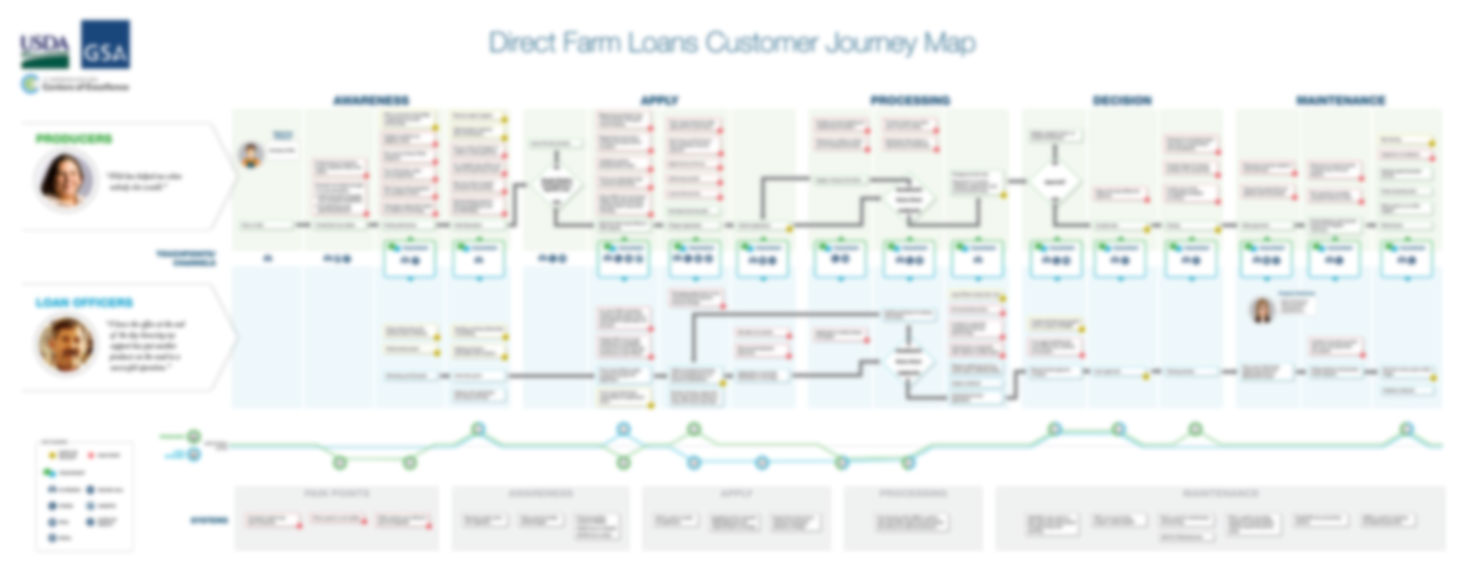
- You’ll also see the information hierarchy, like the five columns of phases, and the rows of steps showing the experiences of producers and loan officers as they move together through the journey.
Touchpoints
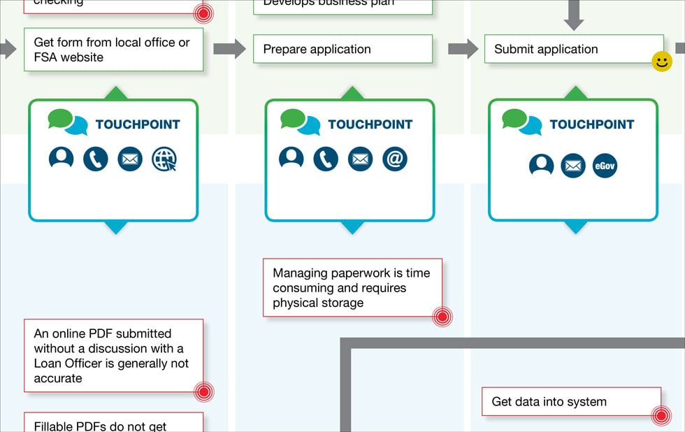
- As the map shows, loan officers and producers are in this journey together. The row of blue Touchpoint boxes connects where producers and loan officers interact with each other (at nearly every step of the journey) and which tools they use (like phone, email, website, or in-person meetings). In this journey map, every Touchpoint (except one) between loan officers and producers has a face-to-face meeting between the two groups.
Zooming In
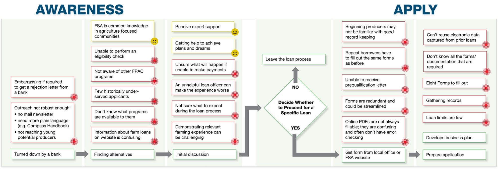
- Structure and color give you more information: The flow of green boxes shows concrete steps in the process for producers (blue boxes for loan officers), with diamonds at major decision points. Each green step comes with red and yellow boxes that highlight the producer’s or loan officer’s emotional journey: The red boxes with red dots show pain points (challenges people face), while yellow boxes with smileys show points of delight.
-
Busy points in the map show areas that are more complicated and emotionally loaded. For producers, phases like Awareness and Apply have more red pain points and yellow points of delight, indicating possible areas to focus on.
-
Zoom in to take a closer look, and you can see dependencies and relationships in how different steps connect to each other, as well as how actions taken by producers impact loan officers (and vice versa).
Emotional Level and System View
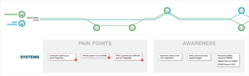
- At the bottom of the journey map, we see a line chart showing the overall emotional level experienced by both producers and loan officers. Just because a step has a lot of red pain points (like in the Awareness and Apply phases for producers) doesn’t mean that it’s a net negative for the customer; lots of pain points in a step may simply mean it’s a longer part of the journey.
- In this journey map, there’s also a diagram of systems used in each phase.
Now that you know how to interpret the pieces of a typical journey map, in the next article, we’ll show you how to put everything together so you can use your journey map to help guide your efforts to improve customer experiences.
Return to Updates