
How to Tell Your Story with Data
Creating Effective Story-telling with Data
Overview
The GSA’s Data & Analytics Center of Excellence (DA CoE) partners with federal agencies to promote the effective visualization of data and analytics.
An organization can make a big impact by telling their story effectively. Providing data as a foundational basis to storytelling adds credibility to the story while ensuring the audience remembers both the underlying themes and the relevant statistics. Effective data visualization is all about presenting information in an easily digestible, convincing, and transparent manner.

Here are 7 tips you can follow to transform your data into a compelling visualization that tells a story.
What is
your story?
Define what you want your audience to learn about your organization and your work.
Why?
Understand how best to structure your data, how to supplement it with external data sources, and determine the tools required.
Who is
your audience?
Understand the differing needs of the end consumers and design the visualizations to address each of their needs.
Why?
Multiple views of the same data can help users with different needs understand the relevancy of data to them, in a way that is succinct and actionable.
What is the best way
to communicate your story?
There are methods for disseminating data, including interactive dashboards, reports, and infographics. Think about the needs of your audience and the approach that will best help them achieve their business objectives.
Why?
Different audiences are looking to use insights from data in different ways. For example, supporting real-time decisions versus understanding a broader narrative. Presenting data the right way ensures it can be used most effectively.
What visuals best
tell your story?
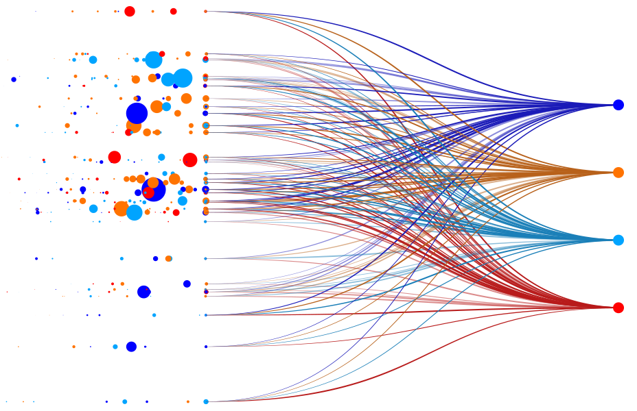
Enhance visualizations with the appropriate combination of colors, sizes, and labels. Display the information without overcrowding the visualization and be clear and concise in your presentation. Present information sequentially, weaving it together to tell a complete story.
Why?
How information is presented visually is a big determinant in how it will be received and understood. Color, size, labeling and sequence of visuals are all important aspects that influence how it’s interpreted.
What is
your narrative?
Your story’s narrative is the underlying connection between data points that tell a convincing story when tied together. It can be achieved through visually highlighting (e.g. bright colors, big labels) the aspects of visuals that you want your audience to focus on. The audience should be able to understand your main message through the visualization alone.
Why?
Your narrative helps audience members relate to the story, and helps set up and support the key takeaway message you are intending.
How do you frame
your story?
To be understood, your story and the underlying context needs to be well established. For example, where the data came from, what it is, and why it is important. Showing temporal or geographic trends that provide backstory is one example.
Why?
Provide context for insights allows your audience to better understand the background of your approach. It also preps your audience to fully appreciate the narrative you want to establish.
What is your takeaway
or insight?
Define the key insights you would like to leave your audience with. Stick to one or two insights per visualization, or only a handful across a series of related visualizations.
Why?
Having a takeaway in mind ensures your story and visualizations are achieving their goals. Leaving audiences with a higher-level narrative and a few pointed statistics is a good way to make sure they become vocal messengers of your story.
The breadth and depth of data available to organizations these days is overwhelming. As data owners and analysts, it’s our job to translate those data in the most effective way; that means telling convincing stories that leave our audiences with the information they need to be more effective in their own roles. A thoughtful approach to data visualization sets up then tells the right story, uses data to define the narrative, and leaves the audience with the intended takeaways.